And it’s goodbye from him …
I’m joining the Great Resignation/the big quit/the turnover tsunami. Yes, it’s another one of those “I’m leaving” posts.

I’ve been at Cedar – and Version 1 post-acquisition – just over 7 years and I’ve enjoyed every minute of the journey. My goal on joining was to grow an Oracle Cloud HCM practice, and – together with some great colleagues – this has definitely been achieved.
We’ve won and delivered to some great clients – 5 full implementations (some across multiple phases) and covering a real range of situations – UK only/global, HCM only/multi-pillar, private sector/public sector, and some multi-year, whilst another was live in just 3 months.
We’ve also hired/cross-trained some great people across the spectrum of experience. It’s been wonderful to watch you grow both personally and professionally, and take on key roles as the practice has expanded.
We’ve worked hard to give the clients what they needed (not always what they thought they wanted though!) and we’ve had a lot of giggles along the way. All the teams I’ve been part of have adapted to remote delivery smoothly and I’m convinced – for one client in particular – we were able to work even more efficiently that way.
My highlight of this time, however, has always been the people. I’m not going to name individuals, but I’ve had the privilege to work with some great friends during this time and I hope you know the high regard and affection I hold for each of you. I look forward to hearing what you go on and achieve.
Thank you, all.
One Shortcut to a better Teams UX
I prefer to use Zoom over Teams for one simple reason – the “push Space to talk” shortcut key – however corporate choices mean I end up in more Teams meetings. There are some calls – particularly when you’re the one hosting – where you need to stay audible as you’re doing a lot of the talking, however there are other calls where others are leading where it’s common courtesy to remain on mute until you have something to contribute. With Zoom it’s a case of holding down the Space bar while you speak and then releasing it to return to muted. Simple and low friction. You don’t even have to look down at your keyboard. There is no equivalent in Teams.
Every time there’s a new release of Teams I check for this one feature – I can’t be the only one feeling this frustration – however I’ve come to the conclusion that if they were going to introduce it they would have by now.
What can Teams do?
What shortcut keys are available in Teams? There’s no ‘push to talk’ key, but there is a ‘toggle mute’ which is almost as good. Unfortunately it’s not a particularly user-friendly key combination = Ctrl + Shift + M. A lot of people are going to need to glance down at the keyboard for that one and the opportunity to add to the conversation may have passed.
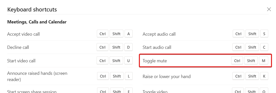
There’s no way I can see in Teams to alter this to something easier to press either.
My fall-back – and I suspect this is the same for most people – is to put down my pen and notepad, reach for my mouse, locate the cursor on-screen and click on the Mute button. Again, not super-slick.
A better way
Rather than tolerate the issue, there is an alternative. You can simply remap a key on your keyboard to the Teams shortcut. It’s still not ‘push to talk’, but if you can toggle mute with a single keystroke it’s an improvement on the current situation.
A quick google shows there are a number of ways to remap keys on your keyboard. There are many free tools (see a list here) however I opted for one which isn’t on that list. Microsoft PowerToys is a free set of utilities from Microsoft intended to make Windows 10 better. One of the utilities it contains is ‘Keyboard Manager’. Here’s what it looks like:

I’ve remapped my Pause/Break button to the Teams shortcut for Mute/Unmute. I’ve picked Pause/Break (shown in red below) as it’s a key I can find quickly and without looking down at the keyboard. Depending on your layouts and usage, other possible options could be keys I’ve shown in blue – they’re on the edge of the keyboard so they’d be easy for your hands to locate.

Note: the Teams window must have focus in order for this to work – as otherwise the shortcut combination is sent to whichever application is currently active – but we should be paying attention to the meeting and not clicking around in other windows anyway, right? 🙂
You could always take this a little further by assigning other hotkeys too. I never use the ‘Scroll Lock’ key so that would make a good ‘Leave Meeting’ shortcut instead of CTRL+SHIFT_B or the pause while everyone reaches for their mouse, locates the cursor on screen and hovers over the leave button.
Manage your SRs better – for free!
I’ve just finished a role where I spent 7 months as the Service Delivery Manager for one of our larger clients. One of the key factors to being successful was ensuring the team had Oracle SRs under control. I don’t find it particularly easy to get an summary of the SR situation by looking at the screen in MOS (My Oracle Support) – you can order the columns but it’s difficult to get an overall view of progress. There’s also the SR dashboard, but that doesn’t work if you look after multiple accounts – as many of us will do.
The solution – as I suspect many of you do – is to drop the data out to Excel to analyse. As it’s something I would be doing frequently I wanted to automate as much as possible in order to be efficient. I’m making my SR Dashboard spreadsheet available in case others find it useful.
Step 1 – Import raw data
The first tab of my SR Dashboard spreadsheet is where I paste the raw data from MOS. You need to make sure the columns are in the right sequence (Problem Summary, Technical SR#, Contact, Severity, Status, Last Updated, Opened, then whatever else you need), then just Export to Excel:

In the ‘Raw Data’ tab on the SR Dashboard spreadsheet, clear out the existing data and paste in everything from your export from MOS.
Step 2 – Inspect the ‘SR List’ tab
The ‘SR List’ tab in the SR Dashboard takes the lines from the ‘Raw Data’ tab, formats it nicely and contains some formulae to display the data better. You don’t need to change anything on this tab, just perform a visual inspection to make sure it looks ok. If there are issues it may be your columns weren’t in the right order or the copy and paste of data didn’t work right.
EDIT: Also see Marc’s comment below if your dates are not coming through in the right format causing the Age formula to break.

Step 3 – Enjoy the Dashboard
Now view the Dashboard tab. On the Excel ribbon at the top select Data, then Refresh All:

Your SR data will now be summarised and displayed nicely. Clockwise from top left the charts show (1) SR Status – the count of SRs by the SR status, (2) SR Age – the count of SRs within each age bracket, (3) the oldest and newest SRs, and (4) SR Owner – who in your team has the most open SRs. Additionally, all the data in the charts is colour-coded by severity so you can see the status of your most critical SRs.
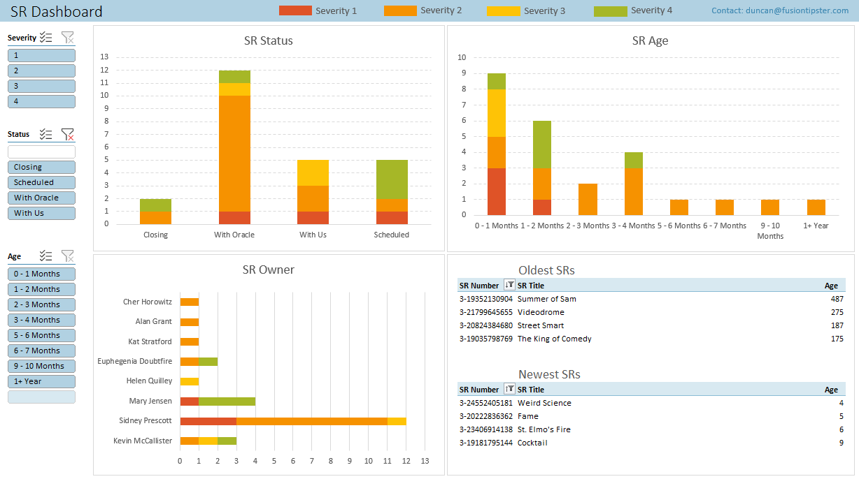
As an additional aid, the Slicers on the left allow you to filter the data displayed. Do you just want to view your Sev1 and Sev2s? Or maybe you just want to see the owners of your oldest SRs? Or maybe exclude SRs which are closing or scheduled? Just use the slicers and the charts update allowing you to further analyse the data:

You might need to tweak it a little if your screen resolution is different to mine. I’d also be interested to hear if you enhance it in any way or have other feedback. Some of the more advanced functionality (slicers, and some formulae) may not work in older versions of Excel.
If you want to try it for yourself the SR Dashboard file can be downloaded here:
Oracle Cloud Weekly returns
I’ve been sending out the ‘Oracle Cloud Weekly’, the free weekly newsletter on all things related to Oracle’s Cloud apps each week – on and off – since October 2012. (If you want a look at issue #1 it can be found here)
For the last year or so it’s been more off than on as I’ve needed to focus on multiple clients at work. Now I’m back down to just one full-time role I can return to the Oracle Cloud Weekly with a bit more energy and start cranking out the issues again.
If you’ve not come across the OCW before it’s a short email once a week combining all the news and blog posts on the Cloud Apps, plus a bit of PaaS, wider industry news and the odd fun item.
As a sample, last week’s issue can be found here.
If you want to be kept informed without having to trawl the internet, just go here to sign up.
Your email will not be shared with anyone else – not even Version 1, our sponsor – and we’ll never send you anything other than the newsletter.
thanks, Duncan
The Redwood UI
There has been an unnecessary amount of concern about the new UI which arrived / is arriving in 20C (depending upon which wave you’re on). Admittedly the wording of the announcement probably hasn’t helped (calling it the new default UI is technically true, but does raise worries). For those already on 20C you’ll already know most of this, but for the others here’s what you need to know.
What is the Redwood UI?
Redwood is the new user interface to Oracle Cloud Apps. If you’ve seen any Oracle presentations or their website since OpenWorld last year it’ll be immediately familiar – a really quite stylish and softer look with African/Oriental/Aboriginal influences and more natural tones than the bright red that Oracle used to use everywhere.
Why are people confused?
The announcement said that Redwood replaces the default theme. This panicked some clients into thinking their carefully crafted, corporate theme was going to overwritten. That isn’t the case of course.
If you have customised the theme you’re using, Redwood will be added as an option that you can select, but will not change the theme in use.
It’s only if you are using an unmodified version of the Sky Blue theme will you be automatically changed. Pretty much everyone will have at least changed the logo and saved as a new theme so will be OK.
Things were confused a little further as some of the documentation for Redwood also touted the benefits of the Newsfeed/Responsive UX. We should all be using Newsfeed already so this shouldn’t be new to us so to mix this in too was a bit superfluous.
Branding Redwood
If you like the look of Redwood but want to give it a flavour of your own organisation you can, but your options are much more limited than if you chose one of the other Newsfeed themes. You can change the logo and background, that’s it – and even then it says they’ll be “Redwood-ised” with a Redwood colour overlay.
Replacing the logo works just fine (although you are instructed to use a monochrome version to maximize readability and accessibility). I tried swapping the background however and it didn’t work, so I think there are still some wrinkles to iron out. Or at least it only changed the cover image, not the background:
To me it had the feel of a theme that has been designed for Oracle to do attractive demos and isn’t quite so geared to customer pods – at least not yet.
I suspect you could change the background with some CSS cleverness but I haven’t tried this yet.
Is that everything?
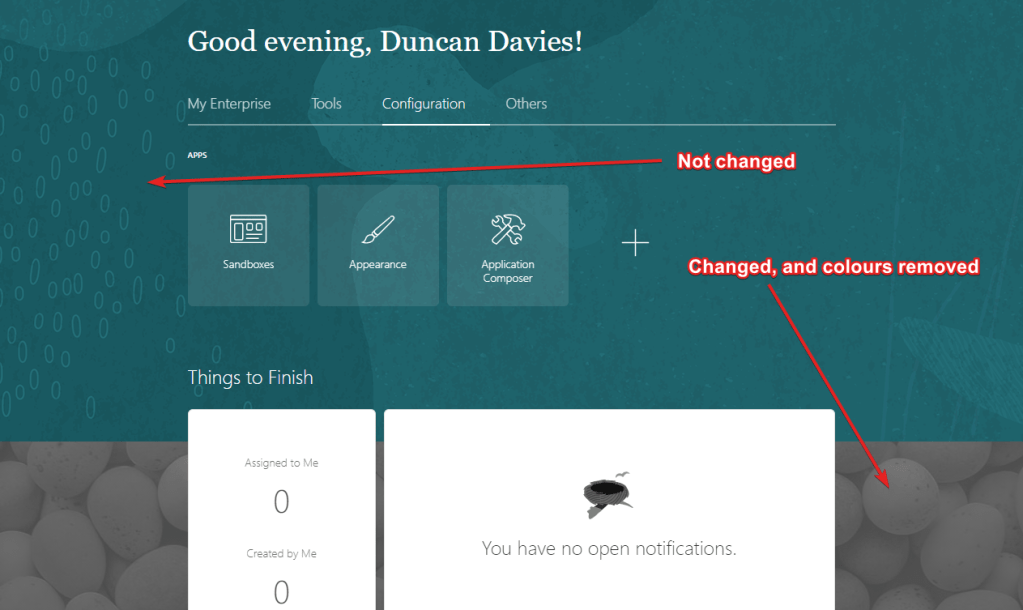
Nearly. Even if you remain on your custom not-Redwood theme you may notice some new icons creeping in that weren’t there before. I’ve not seen any information on this from Oracle so this may be an undocumented change. They do look to have the Redwood style to them, so it looks like we get these regardless of the theme chosen.
If Shooting Stars, Ice Creams and Birds Nests aren’t your thing there’s an idea lab suggestion to give us the option to revert if required. Find it here.
Oracle Cloud Project Management Practitioner
A couple of months ago Oracle announced they’d be releasing a Project Management certification alongside the wealth of technical and functional certifications already available. This caught my eye as having a certified PM is now a requirement for any of the new Cloud Service track Expertises. For example, for a partner to achieve the Oracle HCM Global Human Resources Cloud expertise as a minimum you’d need:
- 2x Implementation Specialists
- 1x Cloud Solution Architect
- 1x Support Specialist
- 1x Project Manager
- plus customer satisfaction surveys etc.
There are a number of options to satisfy the ‘certified Project Manager’ requirement (Prince 2, PMP, Scrum Master etc) however Oracle’s new Cloud Project Management Practitioner certification is also an option so I thought I’d give it a go.
The course content is available to consume in a number of ways. The best is obviously the live sessions, however I struggled to attend these as they’re during the working day. Thankfully the content is available to review at your leisure – both session recordings and the content PDFs – so it’s not difficult to catch-up when you have the time.
Once you’ve absorbed all the material it’s then time to give the exam a go. It’s not an easy one either. The content obviously covers Project Management fundamentals – with a slant towards the Cloud – which is what you’d expect. I enjoyed the sections on the Cloud Delivery Framework and the High Impact Cloud Knowledge Areas (HICKAs).
What caught me out is that the content is across all of Oracle’s Cloud offerings – so while I was perfectly happy answering topics around implementing Oracle’s SaaS offerings, and some of the PaaS offerings around OIC and OAC – the IaaS, MicroServices and DevOps topics were completely alien to me.
I therefore had a bit of learning to do, e.g.
- What are the scoping considerations when lifting and shifting Seibel CRM to Oracle Cloud Infrastructure?
- What is a collection of tags/branches Git and Maven repositories?
- Is a key consideration of a move and improve project to OCI whether the application is certified for ADW?
Once I’d learnt enough to differentiate CI/CD from CASB and MV2ADB from Maven I was all set to give it a go. The test itself is a bit of a monster – 90 questions from a bank of about 300 – so it takes a while and you’ll get a totally different set each time.
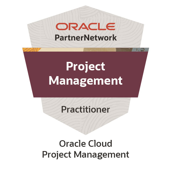
I just missed out on my first attempt (60%, when the pass mark is 70%) however after taking a few days to revise my weak areas I gave it another attempt and happily passed. I now have a new badge:
Thanks to Sarkis Kerkezian and team for the great initiative.
A Deeper Look at the Forrester Wave
Analysts Forrester released their latest report on the state of the HCM marketplace a few weeks back. Although some may argue that analyst opinions do not necessarily have a 100% overlap with customer opinions, I think they’re good indicators of where a suite is broadly in terms of its competitors. Also – by comparing the relative positions in prior years’ reports – you can get an indication of momentum.
Riding the Wave
Here are the The Forrester Wave™: Cloud Human Capital Management Suites, for 2017 (left) and 2020 (right)


So, in which direction have the large HCM vendors moved?
Oracle HCM Cloud has moved strongly upwards, indicating the maturity, depth and breadth of the current offering. In fact, Oracle scores highest here of any vendor. It hasn’t moved to the right however, which I find baffling as Oracle seems to be innovating heavily on all fronts.
SAP SuccessFactors doesn’t fare so well. It’s drifted quite markedly left and downwards. This probably doesn’t mean the product has worsened, although there is confusion over the direction of their HCM offerings and rumours of integration issues, however it may just mean SAP is not keeping up with the pace of its competitors.
Workday has a mixed result moving down and right, with the strategy being well perceived, but the current offering losing ground when compared against the rest of the market.
Vendor Profiles
As well as the much-shared wave diagram, Forrester profiled the vendors. Here are some of the highlights from the Oracle section:
Oracle has more than 5,000 customers on Oracle Cloud HCM (it also quotes Workday as having 2,900 HCM customers)
Following more than a decade of sustained development, which included major investments in user experience design and the acquisition of Taleo (2012), Oracle Cloud HCM now provides a comprehensive, sophisticated HCM suite … Oracle Cloud HCM is a good option for larger, multinational organizations (more than 5,000 employees) with more sophisticated HCM needs, including those using legacy Oracle on-premises solutions (e.g., PeopleSoft).
They also mention many of the innovations what we’ve all heard are happening across the suite:
- Campaigns (CRM within Recruiting)
- Oracle Guided Learning
- Digital Assistant
- Experience Design Studio
plus some innovations I’d not heard much about yet:
- Narrative
- Pay-in-Advance
The full Forrester report can be downloaded here.
Fusion and Oracle Analytics Desktop
In this age of moving everything to the Cloud I tend to pay a bit less attention to desktop offerings than I previously used to, however a LinkedIn article from Philippe Lions shared by Santosh Kumar Bhairi about Oracle Analytics Desktop caught my eye.
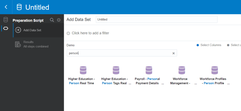
It’s a product I’d not heard of before, but after a bit of research I discovered it’s a program that allows you to connect into all types of data sources and quickly visualise your data. I downloaded it to give it a whirl.
First, you select the Connection to where your data resides. There are about 50 options, and happily Oracle Cloud Apps is one of them:

Next you build your Data Set. It gives you all of the subject areas in OTBI plus all of the Analytics you’ve built to choose from. It also looks like it lets you enter Logical SQL (although I didn’t try this). It doesn’t appear you can enter raw SQL against the database (yet) however.
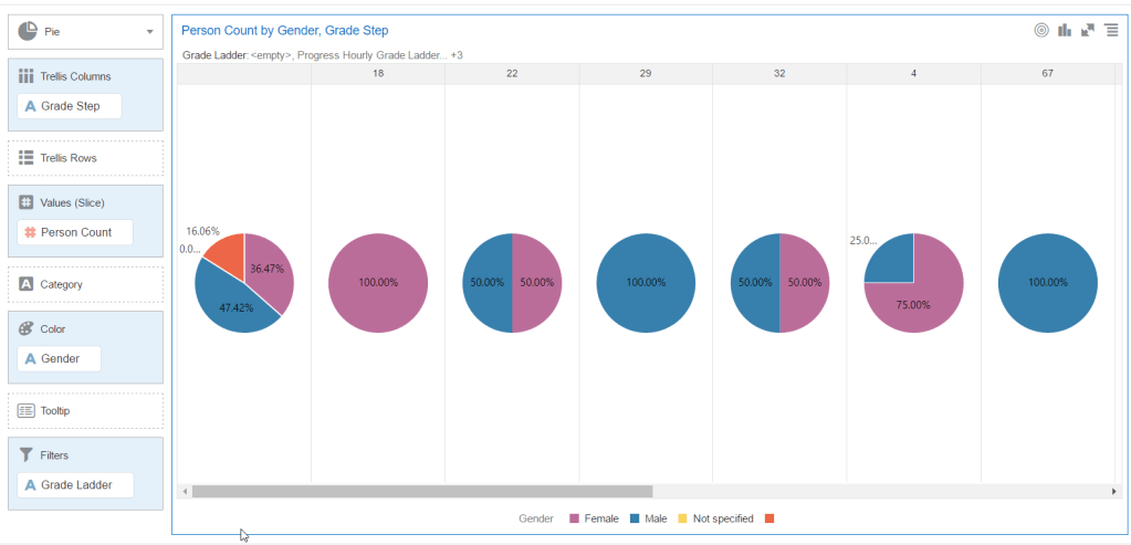
Once you select your Subject Area(s) you then select the Attributes and Measures, giving you sample data at the foot of the screen:

Once that’s done, you can start visualising your data. There are some automated / recommended charts, however it’s dead simple to select your chart type and drag the data fields on. Within a couple of seconds I’d whipped up charts showing gender by grade:
And a quick headcount / map chart:

These aren’t very revealing as they’re based off the Vision demo data, however you can get from clicking ‘download’ to generating some pretty nice charts in less than an hour.
I understand that for training and evaluation purposes you can use it for free. Read more about it here.
Quick Expression Language Evaluation
Expression Language (EL) can be very useful but a little fiddly to use. It can be tricky sometimes to work out what a particular piece of EL code will resolve to.
There are a number of tricks to do this, and one way is to create a simple page showing a listing of known-good EL snippets, e.g.

This above example is created using a Page Integration Wizard page with an HTML Markup area added. Then I inserted a quick HTML table to format the elements using the following code for each row:
<tr><td>UserName</td><td>securityContext.userName</td><td>#{securityContext.userName}</td></tr>
You’ll see above that not all EL snippets resolve, and that because the HTML Markup is in a standalone page. It could just as easily be added to an application page temporarily while you fine tune your EL. If it’s placed within an application page you would be able to resolve ELs that take advantage of page bindings and page flow items.
Solution: BI Issues after Account Rename
Occasionally, when a Fusion user account is renamed, there is a sync issue that prevents the end-user accessing BI. Sometimes the data gets back in-sync within an hour or so, however sometimes the issue persists.
People get married or divorced and change their surname, or may have a name change for several other perfectly legitimate reasons. So renaming user accounts is an occasional but necessary part of most customer’s business-as-usual function – the only reason it might not be needed is if users log on with their employee id, or similar.
If the user has previously accessed BI using their old account name, after the rename they may either get an ‘Error 500–Internal Server Error’ or may be told ‘You are not currently signed in to the Oracle BI Server’, or may just receive blank output while trying to view BI content.
Previously, the solution was to raise an SR with Oracle and the issue would be resolved, however now Oracle have made available a handy self-service utility so we can sort the issue ourselves. Here’s how it works:
1) Locate the URL for the pod
This will be something like:
https://abcd.fa.em2.oraclecloud.com
2) Create the input file
This will be <old username>;<new username> with one pair per line. e.g.
user1;user10
user2;user20
Save this as a .txt file. Other than the extension the filename isn’t important.
3) Download the rename tool
It can be found here.
Unzip the archive and locate ‘RenameAccts.jar’.
If your version of Java is old (pre-1.8 you may hit issues here).
4) Execute the rename tool
Double click RenameAccts.jar and click OK at the first dialogue.
Fill out the fields in the Rename Accounts Details screen. It’s pretty self explanatory:
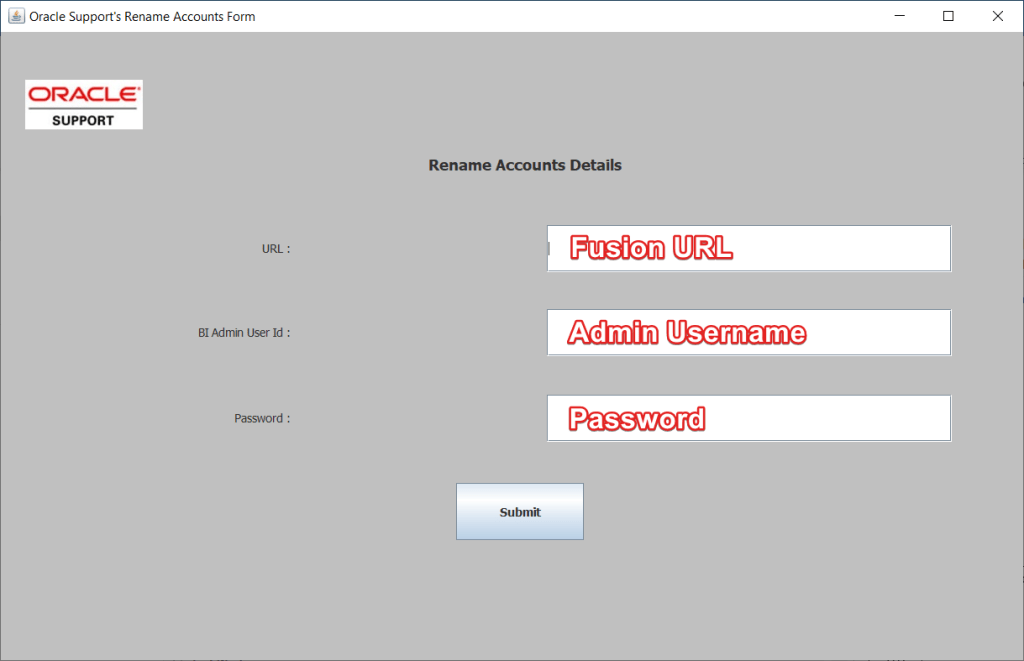
For the URL just use the fully qualified domain name from step #1, not anything after the domain.
Once you click Submit it’ll prompt you for a file. Select the one you prepared in step #2.
It’ll then take a little while to process. At least 10 seconds, maybe more depending up how many rows are in the file.
5) Checking the logs
Once it’s done it’ll say that it’s completed, however this does not mean it was successful. You need to check the logs.
Browse to the same directory that the RenameAccts.jar file resides and look for two log files.
RenameAccounts.out – contains details of successful updates e.g.
User :PrevUser is renamed to user: NewUser
RenameAccountsErrors.out – contains details of unsuccessful updates e.g.
Error while renaming user :PrevUser to : NewUser
Account not found. Please see the server log to find more detail regarding exact cause of the failure.
Tip: it does not appear as though the username is case sensitive in the update.
Tip: Oracle also include a PDF walkthrough of this process at this link.
Tip: If the rename has already happened and you cannot remember what the username used to be, then query FND_SESSIONS to locate the username as it was.
- ← Previous
- 1
- 2
- 3
- …
- 13
- Next →
