Hiding OTBI Root Folders
A new support doc was released on Christmas Eve last year (which may be why I missed it at the time!) describing how to implement functionality delivered via an Enhancement Request. This functionality gives us back the ability to hide root folders within OTBI.
First, a bit of history. A couple of years ago (in release 18A) Oracle removed the ability for customers to ‘modify the shipped BI catalogue content’. This meant we were stuck with the root folders for all Oracle products, even if a customer only purchased one of them:

Although end users who aren’t report authors / power users shouldn’t really be browsing around the catalogue (see this post: Surfacing Reports to End-Users) it’s untidy and confusing.
Happily, Enhancement Request 28108026 was implemented with Release 19d which allows us to provide a tidier solution to any of users who have BI Consumer but do need access to all folders:

Details on how to implement this can be found in Doc 2412231.1.
Caveat 1: This only works for BI Consumer. Users who have BI Platform Author and BI Administrator still see the full list.
Caveat 2: I’ve not been able to remove the Extension root folder yet and have an SR raised for assistance.
Correct Positioning of Background Images
One of my favourite parts of any implementation is the branding. Working with the customer’s teams to shape the appearance of the application is often very rewarding. The colour schemes are often pre-set (as there’ll be a corporate style guide setting out the colour palette with strict rules about the situations in which each should be used) however companies can be a bit more creative when it comes to the background image.
Pattern/Abstract Image
If you’re going for a pattern or something abstract, it’s pretty simple. Here’s the latest Redwood branding from the Oracle demos (which actually looks really nice):

We don’t want any gaps showing around the edges if user’s computer screen resolutions are different though (on home or work devices). How do we deal with that? Just make sure the image uploaded is really big. Here’s Oracle’s actual background image with the red box showing what’s visible on my screen:

It’s pretty safe to assume not many will have a screen resolution so large that gaps are showing around the edge of this background image.
Photo Background
Photos are great choices for a background and give a really impressive result. Ideally you want it to sit nicely along the bottom of the screen, but this is tricky to achieve as different screen resolutions invariably mean:
- some people (with low/small res screens) have the bottom of the photo cut off
- some people (with high res screens) have a gap underneath the photo
Say this striking building in South Korea was your company HQ and you wanted it as your background.

Depending on the resolution on user’s work and home computers, they might well see one or other of these:


Right: unsightly gap at the bottom of the photo
The simple solution is to use a tiny piece of styling code in a simple personalisation to anchor the bottom of the image to the bottom of the user’s viewport – that is, their visible area of the screen. I’m sure there are several ways of doing this, however I favour the CSS background position property.
The result is a background image that sits correctly against the lower edge of the screen:

Cross-Pod Report Links
In one of the comments (on LinkedIn) for the previous post on Surfacing Reports to End-Users Sricharan Monigari asked:
Good idea.. But with every refresh we will have to redirect the hyperlinks to the right instance else they keep referring to the other instance from where it is being refreshed.. Do you have any solution for it?
Sricharan was cleverly thinking ahead to when the instance containing the dashboard of report links is refreshed over another pod. The report links would still point to the previous pod – which would be confusing at the very least.
Dashboard links to analytics are relative – by which I mean the link does not contain the server or domain info, just the path within the catalogue – and therefore need no changes after a pod refresh:
Dashboard links to BI Publisher reports are different. When you copy the link to the report to embed in the dashboard it is an absolute link, i.e. it includes the fully qualified domain name in addition to the report path. This is what Sricharan had thought about. Thankfully there’s a very easy solution.
The link to embed a BIP in a dashboard might look like this:
https//<server>.fa.em2.oraclecloud.com/xmlpserver/Custom/<folder>/<report>.xdo?<parameters>
To make the links portable across pod refreshes, simply replace the FQDN part of the URL and make it relative, as follows:
../../xmlpserver/Custom/<folder>/<report>.xdo?<parameters>
Then your dashboard will work both before and after refreshes.
Surfacing Reports to End-Users
We shouldn’t be expecting end-users to navigate the Reports & Analytics catalogue to find reports, especially now the ability to hide folders that are irrelevant to HCM / ERP Cloud has been removed.

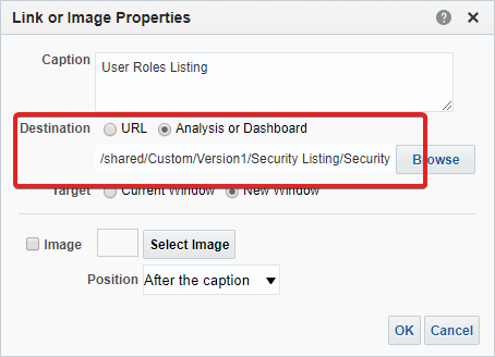
The easiest option is to create a simple dashboard (or set of dashboards) containing the reports instead. You can embed the actual report output, however that takes a bit more planning, so a quick solution is to just have links to the reports in sections.
Something as basic as this is a good start, and gives end-users single-click access to reports without having to hunt through the catalog.
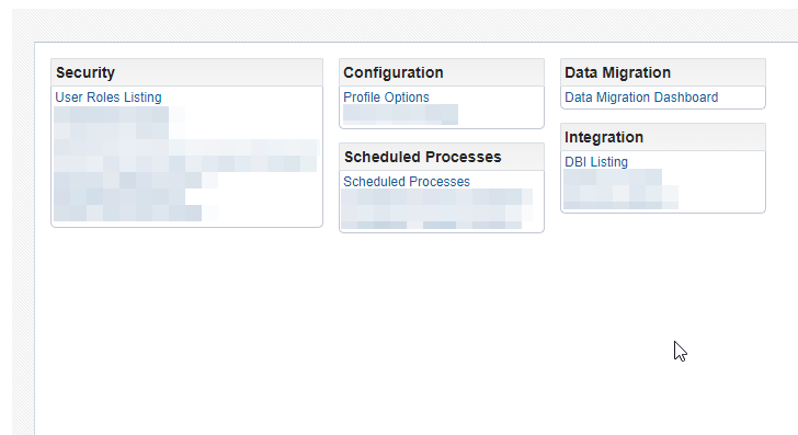
If you want to get a little more sophisticated, each section can have its own set of permissions so end-users only see the sections within the dashboard that are appropriate for them.
Creating the page and tile for the dashboard in the application takes a few minutes, and the dashboard itself can be added to incrementally as your report suite grows without needing to re-personalise the page.
Hiding Areas on Shared Sections
It’s fairly trivial to hide fields/areas on pages by using Experience Design Studio or Page Composer to tweak the visible property. It’s a bit harder when the field/area that you wish to hide is on a shared component, however you only want to hide it on one of the pages it appears on.
In the Responsive ‘Personal Information’ tile we found that the Comments and Attachments section under ‘Add Disability’ was shared with ‘Resignation’.
We still wanted the fields to show on the resignation page, but not on the disability page. How do we achieve this?
Our first thought whenever there’s some conditional logic is to turn to Expression Language (EL). We needed a statement that we could put against the visible property of the fields along the lines of:
when page = Resignation, then visible = true
when page = Disability, then visible = false
So we just needed an EL statement that would allow us to check the page name. After consulting the documentation here we noticed the following:
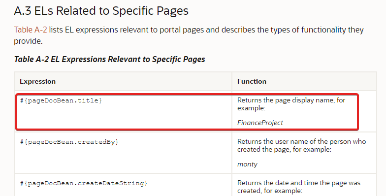
Unfortunately we couldn’t get #{pageDocBean.title} to return the page title – or anything at all, in fact. Other EL expressions from the same page in the documentation worked (e.g. #{securityContext.userName}), but there were none that provided what we needed.
It looks like we’re not the only ones to hit this issue, as there’s a post on Customer Connect about the same issue.
We gave up on this approach and reverted to using a personalisation to inject a small piece of CSS onto the page.
Within a sandbox and Page Composer we inserted an HTML markup area into just the disability page (where we wanted the fields hidden). We then used Chrome Dev tools to locate the ID of the fields that we wanted to hide, and constructed an HTML snippet thus:
<style>
<div selector goes here> {
display: none;
}
</style>
It worked perfectly. Sometimes you have to fall back to basic tools and methods to achieve what you need.
A 2nd look at the HCM Gartner MQ
Towards the tail end of last year the release of the Gartner Magic Quadrant for Cloud HCM Suites for 1,000+ Employee Enterprises caused a lot of excitement. For a number of years Oracle had been positioned behind Workday by Gartner in their Magic Quadrant graph. In 2018 they were approximately level, and then in 2019 – for the first time – Gartner positioned Oracle HCM Cloud as ahead (in that it was the furthest up and to the right on the Quadrant).
This was obviously celebrated by much delighted posting on LinkedIn and Twitter with screenshots of the Magic Quadrant graph itself, and with good reason as it’s a positive message:

With all the delight at now being ‘ahead’ on the quadrant graph itself, I feel that some of the other messages in the narrative of Gartner’s report were missed (and – although there are naysayers about its rankings – it is a very comprehensive report).
The full report is well worth a read, however I’m going to pull out a few of Gartner’s comments that I think are the highlights:
Having closed all major gaps in product breadth, Oracle has more recently focused on innovation in UX, enhancing newer modules, as well as deepening support of hourly workforces. … The product is well suited to MNCs that want a global SOR for core HR and talent processes. During the past few years, Oracle has exhibited a sustained commitment to expanding and deepening its HCM applications.
Strengths
Oracle HCM Cloud’s overall customer reference satisfaction with application functionality is well above average for this Magic Quadrant.
Oracle is one of only two vendors included in this research offering feature-rich platform as a service (PaaS) capabilities. Oracle scored well above average for mobile support, incorporation of emerging advanced technologies and integration of HCM suite with other applications.
Oracle has demonstrated vision and innovation by adding an Experience Design Studio, as well as expanding the use of digital assistants, mobile responsive design and alternative UX.
Cautions
Here, Gartner commented on configuration limitations (and mentions that Experience Design Studio will aide here, but at the time was not fully rolled out). They also mentioned that reference customers are harder to locate outside of North America, UK, India and APAC.
Summary
In summary, it looks like Oracle was adjudged to be in a great position. There were plenty of strong positives and they weren’t called out for any cautions that are as glaring as the competition:
- SAP – “challenges associated with disparate acquired architectures, such as complex implementations, release absorption and reporting”
- Workday – “has application functionality gaps relative to its competitors” and “customer satisfaction with the value of the product for the money spent is well below average”
It feels a little like commenting on a school pupil’s report card, but Oracle HCM Cloud has made some large strides forward during the year and this progression is reflected in the results attained.
Fusion Security Features – 1 good, 1 bad
In the last week I’ve discovered two features of HCM Cloud security that I’d not encountered before – one is a bit of a pain, at least until you know how to work around it, and the other could be pretty useful but it’s tucked away in a counter-intuitive place.
Here’s the detail:
The Bad – Expression Language not Resolving User Roles
We encountered a situation where the visibility of a springboard tile was being controlled by a piece of Expression Language, however it wasn’t working like it should – the user had the role required but the tile was not displayed.
The EL was something like this:
#{securityContext.userInRole[‘ROLE_X,ROLE_Y,ROLE_Z’]}
and we’d performed the following checks:
- Double checked I’ve assigned the role to the user
- Made sure we’d used the Job role in the EL
- Run the security jobs (Retrieve LDAP, Import User and Data, Send LDAP)
- Regenerated the data role
- Logged out and cleared the browser cache
however the tile was still not displaying.
After a bit of research I was grateful to find this post on Cloud Customer Connect by Ashish Harbhajanka. It explains that if the pillar portion of the URL displays a different value to the type of Job Role you’ve defined, it may fail to resolve it. This is what was happening in our situation, the URL contained ‘fscmUI’ e.g.
https:/[POD URL].oraclecloud.com/fscmUI/faces/FuseWelcome
however our role was an HCM Job role, and thus the EL was failing to resolve it correctly.
The solution – which is also documented in DocID 2444823.1 on MOS – is to amend the URL or to add a Common Duty Role.
The Good – Simulate User
Most people know with the ‘Security Console – Roles tab’ you can simulate the Navigator based on the permissions granted by an individual role. This isn’t particularly helpful if a user has many roles however – how do you find out which roles are granting access to a tile that you’re trying to hide? You’d have to go through each role in turn.
Within the ‘Security Console – Users tab’ you can call up all the roles a user has, but you’re not able simulate the Navigator so that doesn’t help either.
The trick is to go back in to the Roles tab and search for a User – which is completely counter-intuitive – but if you change the default selections of the checkboxes the search works. Then you can simulate the entire navigator for a user across all roles.
Here’s a 30 second walkthrough:

Our Most Useful Implementation Report
Every implementation team will have a mini arsenal of reports and dashboards they use to make common tasks a little less routine. Many will be variations on the same theme, however others will vary. I thought I’d share the one I use the most.
Problem Statement
Security Console allows you to compare the contents of two roles with a number of filters. It does not, however, allow you to compare two users. I often find myself in a situation where one user can see a tile or access some data that another cannot. How do you quickly troubleshoot this? Look at one user in Security Console, screenshot their roles, then look at the other user and spot the difference? That’s not particularly effective.
Our Solution
Our solution – and there may be others – is a quick dashboard. At the top are two prompts, one for each user that you are comparing. When you hit ‘Apply’ three columns refresh –
- Roles only the first user has
- Roles on the second user has
- Roles both users have
It allows you to see the differences in seconds, and you can copy/paste the results straight off the screen or download to Excel.

If you make it easily available from the Springboard then accessing it is super-easy:
The sharp eyed may notice that these are BIP reports and wonder why I’m not using the new Security Subject Area in OTBI. The reason is that I wanted Role Name, not Role Code. The former is harder to get from OTBI.
Duck-Typing and a Homepage Warning for IE11
During a testing phase on one of our current clients we encountered an issue where some HCM Cloud pages weren’t displaying correctly to users who used the Internet Explorer browser.
This presented us with a problem, as Microsoft no longer really support IE11 (recommending Edge instead) and some users weren’t even on the latest release, having versions as far back as IE6 – which has been outdated for at least 15 years. With it not being supported by MS it’s not fair to expect Oracle to fix the issue. We cannot force all users away from IE as although the company could mandate a more modern default browser via AD group policy we cannot control what users choose to have on their personal laptops.
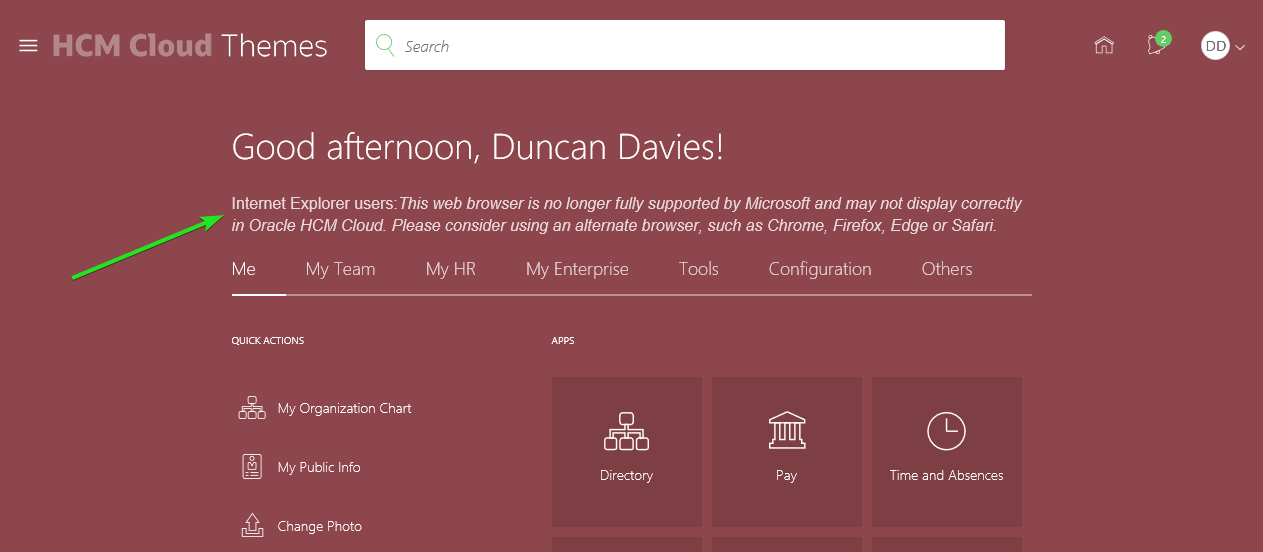
So it was decided that we would still allow users with IE11 and prior versions to access HCM Cloud, but to place a warning on the homepage to inform them that they’d get a better experience on a more modern browser. We obviously don’t want to trouble users of other browsers with this message however.
Identifying Browsers / Duck-Typing?
A little research on identifying browsers via Javascript led me to understand that checking the browser’s user agent string is not reliable. The best-rated solution on Stack-Overflow uses a technique amusingly called duck-typing. This uses a duck test—“If it walks like a duck and it quacks like a duck, then it must be a duck”—to determine if an object can be used for a particular purpose. In this case, instead of querying the browser user agent (essentially expecting the browser to accurately describe itself), duck typing tests how the browser behaves. If it behaves in the way we know IE browsers behave, then it must be IE etc.
Here’s the Stack Overflow answer.
Displaying a warning for only Internet Explorer users
Now we can identify IE users, we need to display a message to them.
First I decided where the warning would look best, deciding on just below the welcome greeting. I copied the name of this div for later use.
Within a Sandbox I used Page Composer to edit the springboard. I added an HTML Markup object and named it ‘IE11 Warning’.
Within the HTML Markup I added content that contained some javascript that appended to the greeting div with the warning only for users that we’d identified as IE11 via duck-typing.
The End Result:
It works a treat, displaying for IE users and not for anyone using other browsers.
HCM Cloud at the V1 Oracle Apps Day
We held our annual Oracle Apps day in London earlier this month so I thought I’d share a little about the event for those that couldn’t make it.
The acquisition by Version 1 has allowed us to expand our traditional annual Cedar event significantly, to the point where we have 7 concurrent streams of content and around 250 customer attendees.
There have been a couple of recaps of the event from a general perspective, however this one focuses on the HCM Cloud stream.
Paddy’s Welcome
The day kicked off with a welcome from Paddy Meany, Version 1’s Practice Operations Director. This was the point we realised it was a full event as the Version 1/Cedar and Oracle attendees were ushered into a separate room to watch the welcome via a TV link as the main room was so full of attendees.

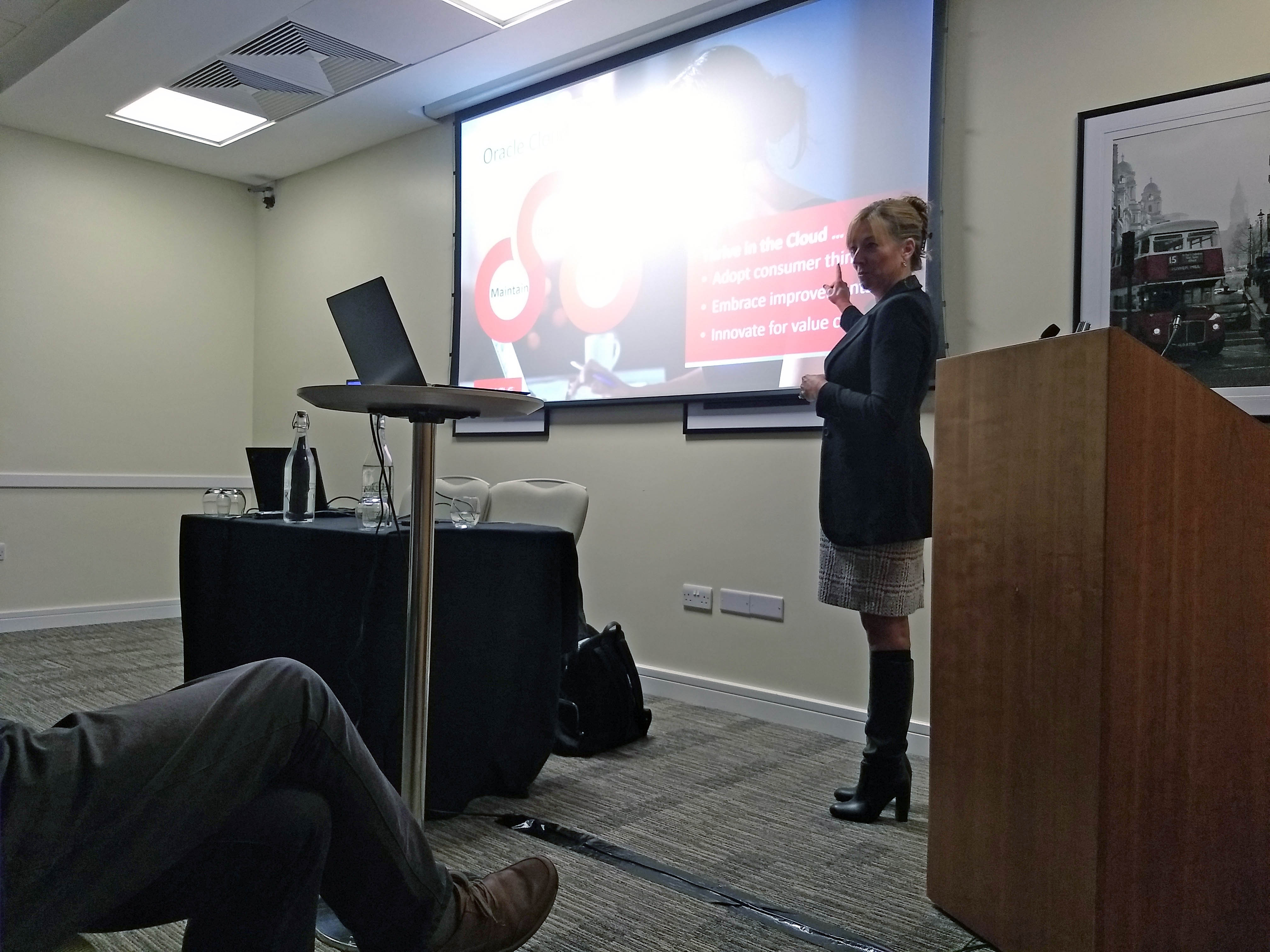
OpenWorld Announcements: Roadmap & Strategy – Tracy Martin
The first session in the HCM Cloud stream was from Tracy Martin – VP of HCM Cloud Strategy.


Tracy highlighted the themes from OpenWorld around the innovation that Oracle continues to bring to HCM Cloud across all fronts, including areas such as Chatbots, Machine Learning, AI, Blockchain, User Experience or further depth and breadth within HR functionality.
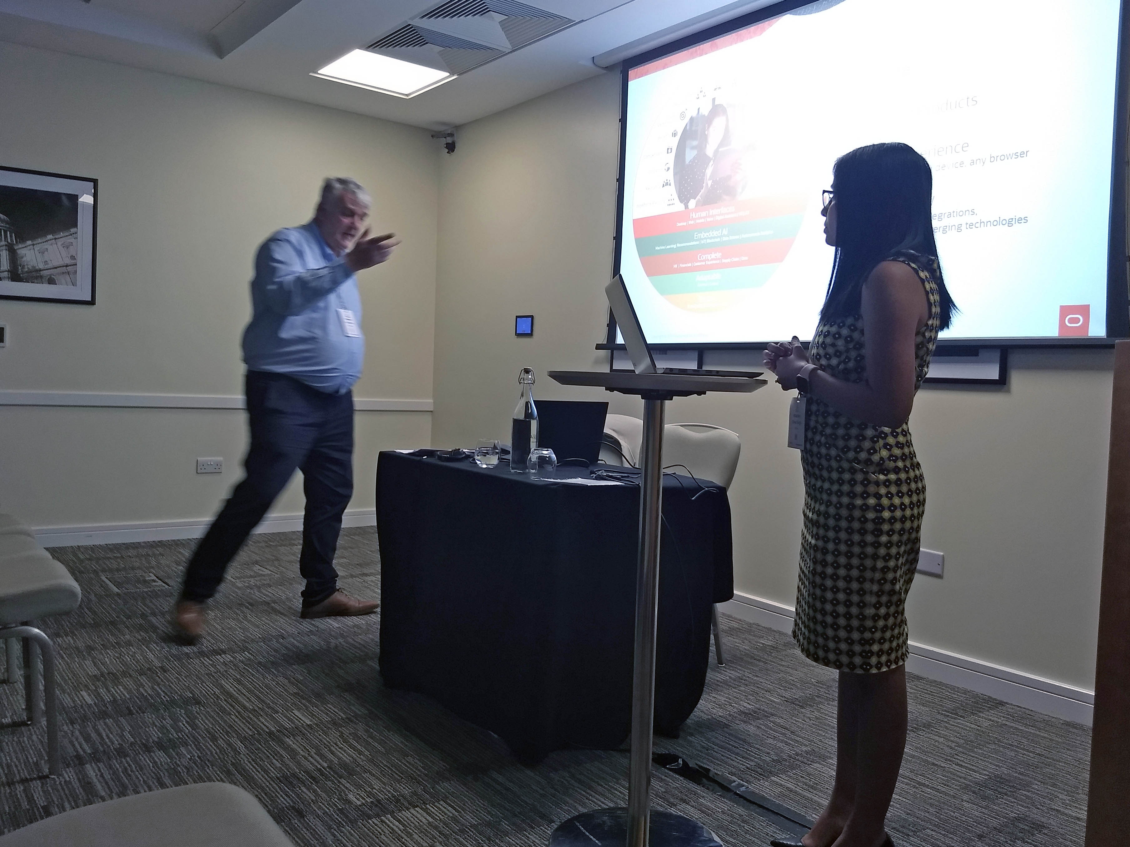
Oracle Recruiting & Learning Clouds
Next up were Tom Stewart and Rickesh Patel who demoed some highlights of the Learning and Recruiting Cloud products and how they fit in with a company’s Talent Management strategy.
Experience Design Studio & Conversational UI
Following straight on, Rickesh then showed us the functionality that is imminent in upcoming releases for Experience Design Studio and then spoke about the Digital Assistant capabilities that can be enabled within HCM Cloud.

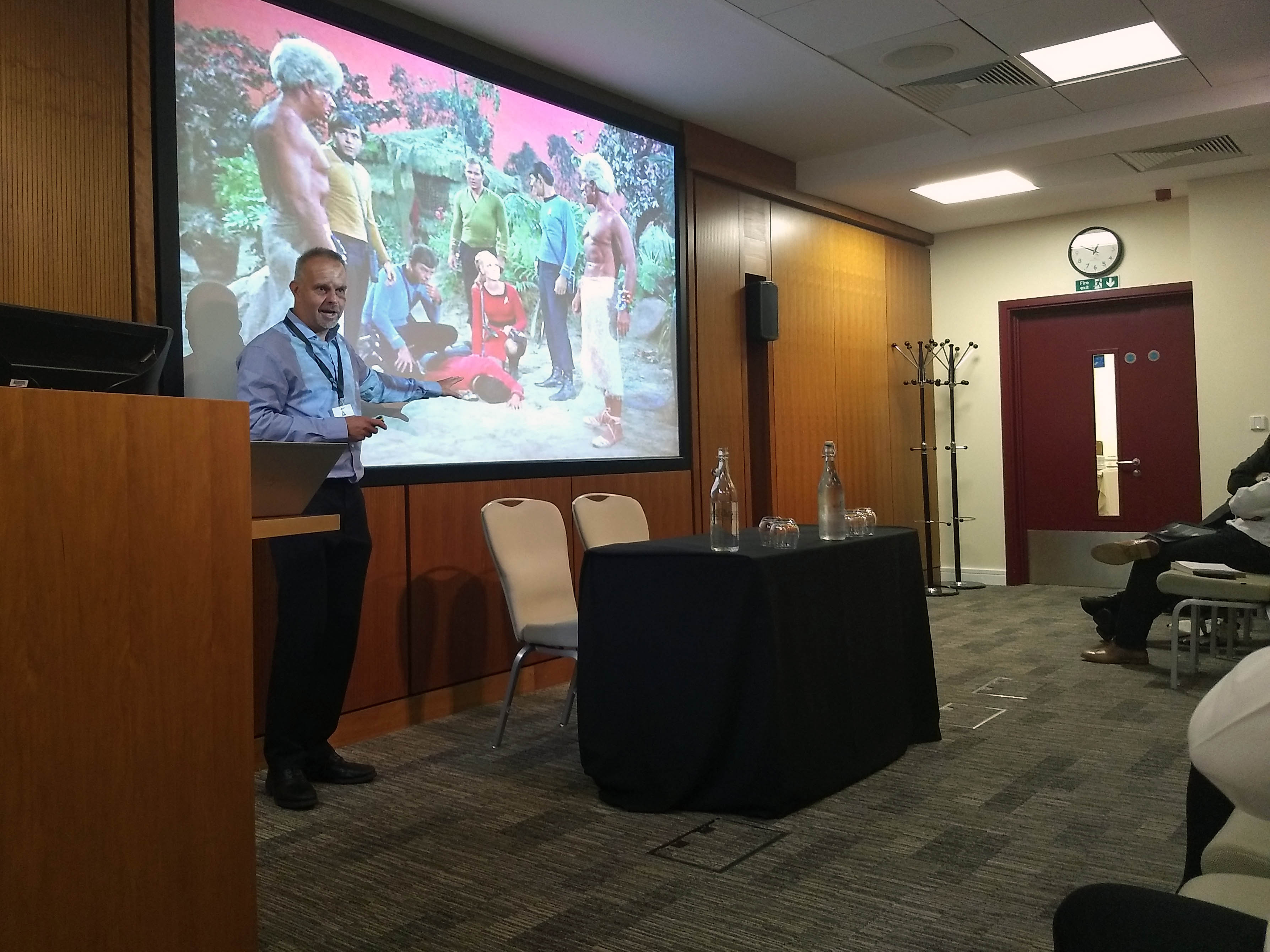
What has Star Trek Taught us About the Cloud & Other Universes?
Leading up to lunch we had probably the most intriguing session of the day as our own Graham Varley shared 5 lessons for Cloud implementation success, by drawing parallels from Star Trek episodes.
Cloud Deployments – What Do the “Great Ones” Do?
Straight after lunch Tracy Martin took the stage again to share some key characteristics of the most successful Cloud deployments and also some of the bear traps to avoid.
Reducing Costs in HR Service Delivery
Jules Peters and Divya Singh ran a session on how HCM Cloud can support an organisation’s HR transformation program – Jules rarely stops moving so apologies for the poor photo.
Managing the Fusion Update Cycle
I had the final session of the day and shared some strategies for getting the maximum value from the Quarterly Releases while keeping the effort for each update to a minimum.
The Social
Finally, all the attendees came back together for a social.

It was a great day, and I’m sure it’ll be even bigger next year.
