UI
Correct Positioning of Background Images
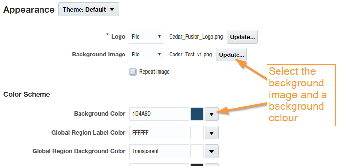
One of my favourite parts of any implementation is the branding. Working with the customer’s teams to shape the appearance of the application is often very rewarding. The colour schemes are often pre-set (as there’ll be a corporate style guide setting out the colour palette with strict rules about the situations in which each should be used) however companies can be a bit more creative when it comes to the background image.
Pattern/Abstract Image
If you’re going for a pattern or something abstract, it’s pretty simple. Here’s the latest Redwood branding from the Oracle demos (which actually looks really nice):

We don’t want any gaps showing around the edges if user’s computer screen resolutions are different though (on home or work devices). How do we deal with that? Just make sure the image uploaded is really big. Here’s Oracle’s actual background image with the red box showing what’s visible on my screen:

It’s pretty safe to assume not many will have a screen resolution so large that gaps are showing around the edge of this background image.
Photo Background
Photos are great choices for a background and give a really impressive result. Ideally you want it to sit nicely along the bottom of the screen, but this is tricky to achieve as different screen resolutions invariably mean:
- some people (with low/small res screens) have the bottom of the photo cut off
- some people (with high res screens) have a gap underneath the photo
Say this striking building in South Korea was your company HQ and you wanted it as your background.

Depending on the resolution on user’s work and home computers, they might well see one or other of these:


Right: unsightly gap at the bottom of the photo
The simple solution is to use a tiny piece of styling code in a simple personalisation to anchor the bottom of the image to the bottom of the user’s viewport – that is, their visible area of the screen. I’m sure there are several ways of doing this, however I favour the CSS background position property.
The result is a background image that sits correctly against the lower edge of the screen:

Branding Fusion and the Visually Impaired
The latest versions of Oracle HCM Cloud look gorgeous and you can create some great first impressions with a well put together theme:
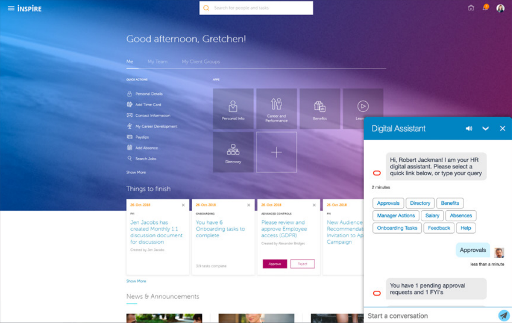
This is great when you need to create an attractive conference slide to catch attention, however when it comes to real-world branding there are complications such as how to provide a user experience that suits everyone in the company – particularly those with less than 20:20 vision.
Nice touches like jaw-dropping photo backgrounds and gradient shading tend to get dropped in favour of making a higher-contrast landing page that’s accessible to all.
It doesn’t have to be like this however as you can use the logon URL to change the theme on a per-session basis. This means that you can create the look that you want for the users who want the ‘fully branded’ look-and-feel and provide an alternative logon URL to provide a higher-contrast theme to the same pod for those that prefer a clearer look.
e.g.
Default theme:
https://pod.oraclecloud.com/fscmUI/faces/FuseWelcome
Alternative theme:
https://pod.oraclecloud.com/fscmUI/faces/FuseWelcome?fndThemeName=Aquamarine
Fixing the R13 Announcements Panel
In the R13 upgrade the announcements panel seems to have taken a retrograde step. It used to have a solid white background, have rounded corners and a semi-transparent border, and the contents of the announcement were indented nicely. Something like this:
In R13 we’ve lost the border, the rounded corners, the opaque background and the indent on the contents. It now looks like this:
We do have the option of switching to a banner layout, or replacing the content with an image (where we can more closely control the layout), however what if we just want it back as it was?
You can get it to look very similar to how it used to, you just need a little HTML/CSS.
If you go into the HTML code view of your announcement content and wrap it in a DIV element with some CSS styling it can look like this:
- opaque background? – check!
- semi-transparent border? – check!
- rounded corners? – check!
- indented content? – check!
The wrapper DIV code I used was:
<div style="margin: 20px 0 50px 20px;padding: 20px 20px 50px 20px;background: white;border-radius: 20px;">
...
announcements content
...
</div>
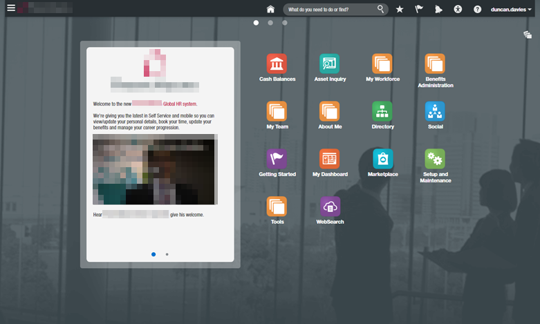
Free Oracle HCM Cloud backgrounds
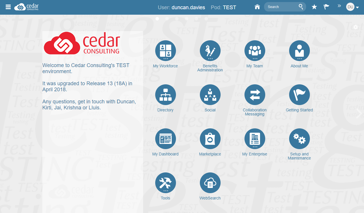
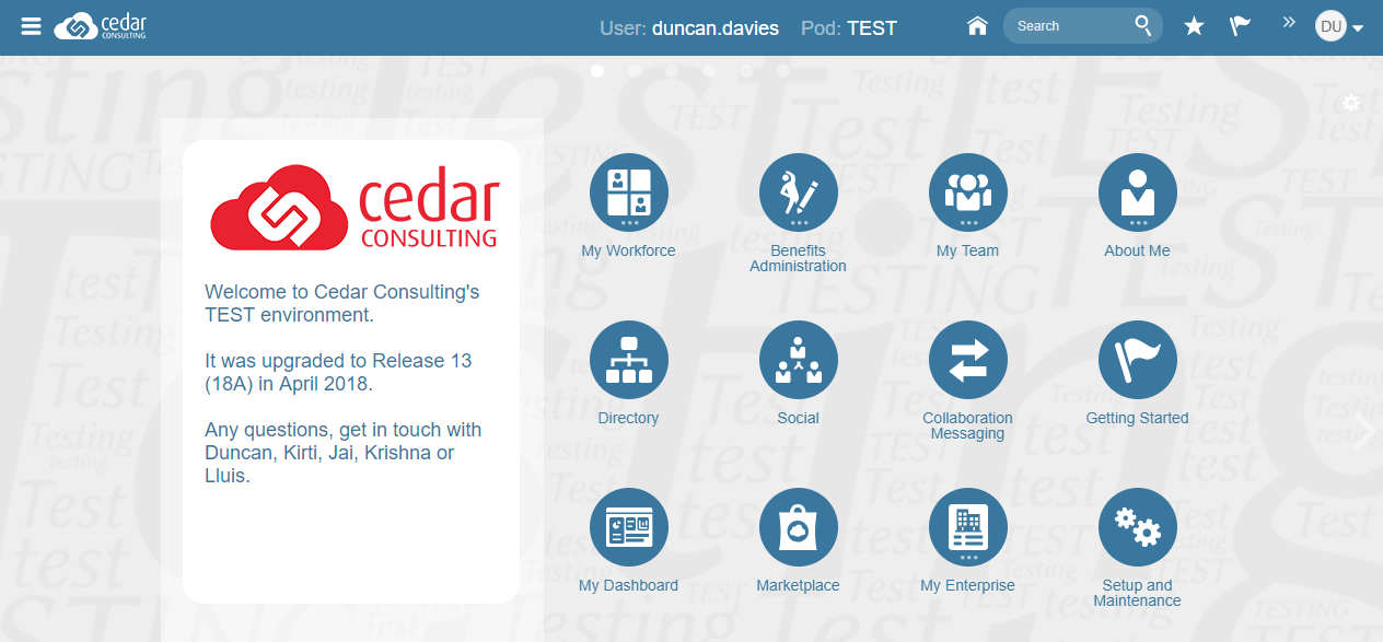
It’s a common practice to change the background colour of your environments to give a visual clue which is which. This helps reduce confusion and lessens the risk of entering test data into Production.
Whilst the core project team might easily remember which colour corresponds to which environment (e.g. blue=Prod, red=Dev, green=Test) it’s not so easy for more occasional users. There is a solution for this.
We’ve created some semi-transparent backgrounds that prominently feature the name of the environment. They’re semi-transparent so that your background colour of choice can still show through. Here’s what they look like:
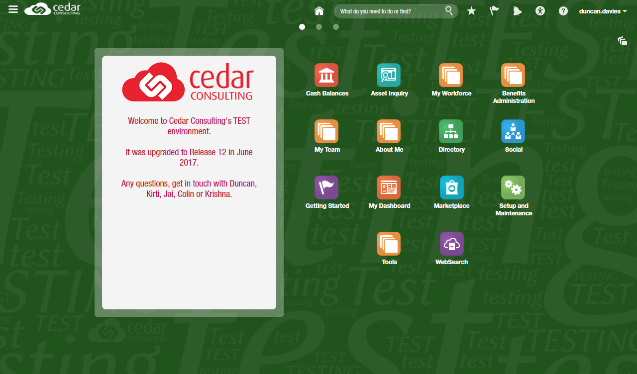
You should be able to see the words Test and Testing on top of the green background. This gives less frequent users more certainty they’re logged on to the correct environment. I’ve chosen a green background colour here, but any (reasonably dark) colour can be chosen and the lettering will still show.
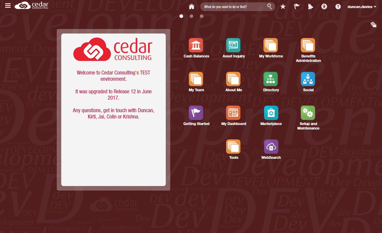
Here is the Development background image on top of a red background colour.
The images work with both Release 11 and 12, and can be downloaded here:
Remember, the lettering is semi-transparent so they might look like a blank image until you select a background colour behind them:
I’d be happy to create additional environment backgrounds if enough people show an interest.
 Fusion Tipster