Fixing the R13 Announcements Panel
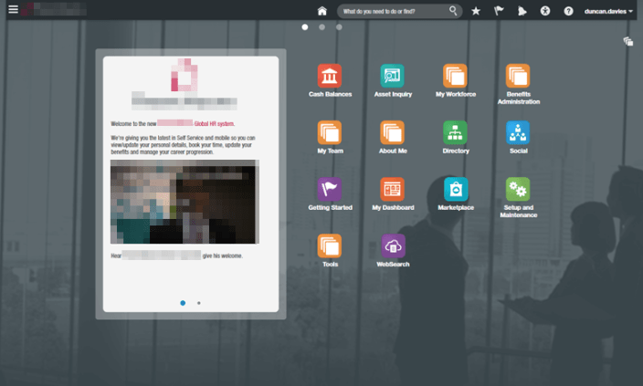
In the R13 upgrade the announcements panel seems to have taken a retrograde step. It used to have a solid white background, have rounded corners and a semi-transparent border, and the contents of the announcement were indented nicely. Something like this:
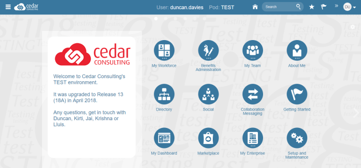
In R13 we’ve lost the border, the rounded corners, the opaque background and the indent on the contents. It now looks like this:

We do have the option of switching to a banner layout, or replacing the content with an image (where we can more closely control the layout), however what if we just want it back as it was?
You can get it to look very similar to how it used to, you just need a little HTML/CSS.
If you go into the HTML code view of your announcement content and wrap it in a DIV element with some CSS styling it can look like this:
- opaque background? – check!
- semi-transparent border? – check!
- rounded corners? – check!
- indented content? – check!
The wrapper DIV code I used was:
<div style="margin: 20px 0 50px 20px;padding: 20px 20px 50px 20px;background: white;border-radius: 20px;">
...
announcements content
...
</div>
