Doughnuts and HCM Cloud
Today is – apparently – National Doughnut Day, so here’s a very tenuous way of talking about Oracle HCM Cloud within the context of doughnuts.
A couple of months back I tried to find a way of getting doughnut charts within OTBI in HCM Cloud, as they look more modern than a traditional pie chart. I couldn’t find a way so posted in Oracle’s Cloud Customer Connect site and learnt two things:
a) doughnut charts are not yet supported in OTBI, and
b) pie/doughnut charts are a poor choice of visualisation in almost every circumstance
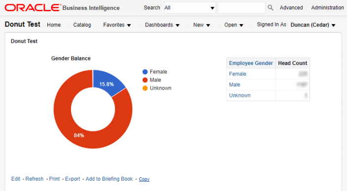
I temporarily abandoned my quest and it was only while looking at another post on Headcounts on a World Map featuring some excellent work by Damien Roux and Julian Challenger that I realised that they are calling out to Google Charts from within OTBI. I had a look at the available chart types in the Google Charts Gallery and lo-and-behold, there’s a doughnut chart!
Using the same techniques as Damien and Julian (using the Google Charts javascript within a Narrative view) it was relatively trivial to get a simple doughnut chart within OTBI:
Happy Doughnut Day!
Footnote:
Google Charts can do a lot more than just doughnuts and maps. Have a look at Gallery 1 and Gallery 2 for a broader range.
