Taking HCM Cloud UX even further
I attended a great webinar recently given by Chris Leone (Oracle, SVP Apps Development) on the Cloud Customer Connect site. Chris walked through some of the HCM Cloud UX changes coming in Release 13 and the updates in 2018.
First of all, if you’re not a member of Cloud Customer Connect, you should be. There’s some great content on there and regular webinars.
So, what did I learn from Chris?
Intro
During his introduction slides we obviously heard about Oracle’s commitment to embrace leading-edge technology, their desire to keep the UX fresh etc. One comment I really liked was:
Deliver a warm and approachable HCM tool that people will use
We’ve all used applications in the past that have been fussy over how steps are performed, or been told “you just need to do the process this way because that’s how the system works”. This is starting to change though and we’ve recently had a client pass-up on the chance of training as the system was intuitive enough for them to work out without assistance. “Warm and Approachable” is taking it a step further than just ‘intuitive’ so I look forward to seeing that in practice.
Improvements
These are the enhancements that I noted during the webinar:
- All Self Service pages will be moving to a new mobile responsive layout over the next 12 months, making mobile use significantly easier
- Type-ahead in fields
- Better prompting/look-ups
- A new homepage
New Homepage
We’re going to get the choice between a new twist on the existing formats (shown on the left below) and a more contemporary version in a vertical layout (on the right):

The vertical layout is particularly interesting as it combines several of the areas that you’ll want to see into a single page (Quick Actions, Tasks, Infolets). This is the MSS view:

It has tabs at the top to switch between Employee and Manager actions (there could be other tabs here, for HR perhaps), quick actions on the left, and the applications on the right.
Simplified Pages
Some other really great functionality that Chris teased was dramatically simplified pages.
For some flows (e.g. promotion) you can select the areas that you wish to amend:

This means that the user isn’t shown sections that aren’t relevant.
Also, the areas of the screen are broken down into collapsing sections:
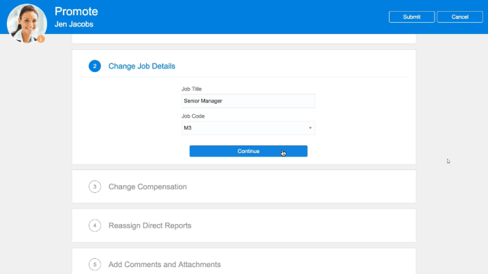
So when a user has finished a section and scrolls down the next area automatically expands. The demo was very slick.
Summary
The UX has taken a big jump forward over the last couple of years, however it’s continuing at the fast pace with some well-considered enhancements to keep making life better for the end-users.
The full 45 minute video can be found here (Cloud Customer Connect account required):
https://cloudcustomerconnect.oracle.com/posts/f851fbfffe
