Branding R13 (pre-Newsfeed UI)
The branding in Release 13 is a touch different from what we had in R12 as we’ve been given a few more options in the Appearance toolkit. Oracle have upgraded Cedar’s partner environment to 18A so we’ve refreshed the look’n’feel. The 18B update later this year brings in the new ‘newsfeed’ responsive UI, but until then let’s see what we can do with the current toolset:
Layout
The first choice is for the overall springboard layout: Panel or Banner?


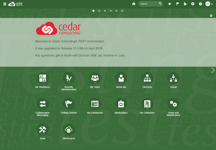
Panel is the layout we used to use in R12 (on the left, above), and we get a new option of the Banner layout in R13 (on the right). If we use the Banner layout we also get to choose what appears in the horizontal banner: Social, Announcements or nothing (hide the banner altogether). We like using the Announcements as it gives the most control over the contents.
Colours
Now you can move on to the colour scheme. There’ll likely be a mandatory corporate brand that you have to follow here so there probably isn’t much choice for Prod. We strongly recommend going for a markedly different colour in each environment however, so it’s easy to quickly distinguish them.
We also use a background watermark with the word ‘Testing’ on it to help further in that respect. More on that here.
Other Options
Finally, there a host of other options such as icon size, shape and colour. You can also alter the appearance of some of the pages and buttons. As a final touch you’ll want to replace the Oracle logo in the top left (we’ve found that 134×25 pixels works best) and you’re good to go.
You can create a number of styles really quite quickly: